Choosing calm colors for your home can make each room feel more comfortable, balanced, and inviting. Soft colors do not have to be plain or boring. With the right shades and combinations, you can create a peaceful look while still adding personality and warmth.
The best color choices depend on your home’s natural light, room size, furnishings, and the mood you want to create. Use the following tips to build a calm color palette that feels natural and works well throughout your space.
Start With the Feeling You Want
Before choosing paint or decor, think about how you want the room to feel. Calm colors often create a sense of ease, but different shades can produce different impressions.
For example:
– Soft blue can feel fresh, open, and airy.
– Muted green can bring a natural, grounded quality.
– Warm white can make a room feel clean without seeming cold.
– Pale beige can add comfort and softness.
– Gentle gray can create a simple, modern backdrop.
– Dusty pink can add warmth without becoming too bright.
Consider the room’s main purpose. A bedroom may benefit from quiet, restful shades, while a living room might work well with warm neutrals and subtle earthy colors. In a home office, a soft green or blue-gray can provide a calm background without feeling dull.
Pay Attention to Natural Light
Light can change the way a color looks throughout the day. A shade that appears warm in the morning may look cooler in the afternoon, depending on the direction of the windows and the type of light entering the room.
Rooms with north-facing windows often receive cooler, softer light. Warm whites, sandy beige, and muted taupe can help balance this effect. South-facing rooms usually receive more direct light, so cooler shades such as soft gray, pale blue, or gentle green may feel comfortable.
East-facing rooms tend to receive warm morning light and cooler light later in the day. West-facing rooms may look softer earlier and warmer in the afternoon or evening.
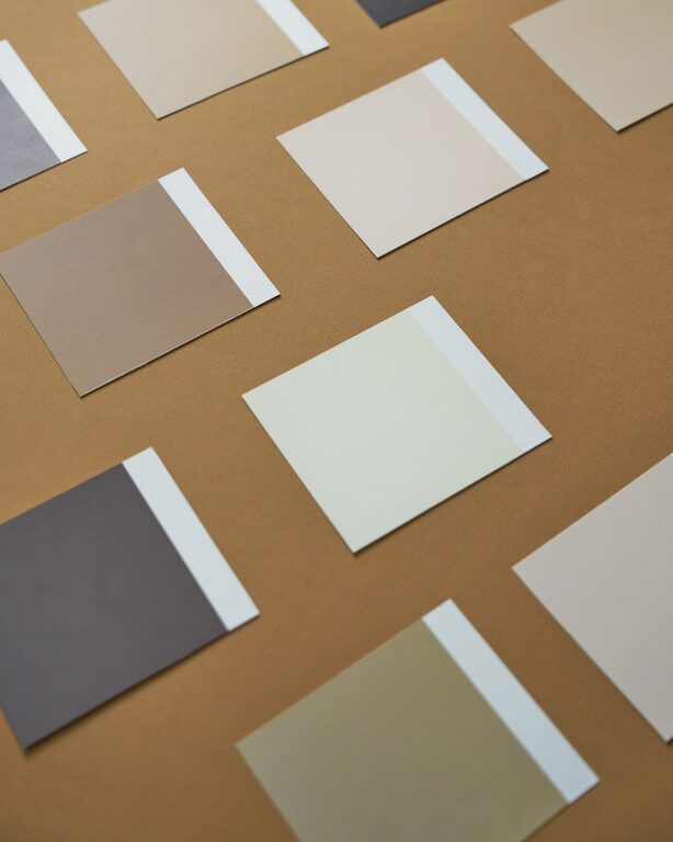
Always test a color in the actual room before making a final decision. Paint a small section of the wall or use large sample boards. Look at the color in the morning, afternoon, and evening to see how it changes.
Choose Colors With Gentle Undertones
Every paint color has an undertone, even if it appears neutral. Undertones may be warm, cool, or slightly green, pink, yellow, or blue. These subtle qualities can affect how colors work together.
For a calm and coordinated look, try to choose colors with related undertones. For instance, a warm beige usually pairs well with creamy white and muted brown. A cool gray may work better with soft blue, pale lavender, or crisp white.
If you combine colors with very different undertones, the room may feel less balanced. This does not mean the colors cannot work together, but they may need careful placement and support from furniture, flooring, or accessories.
When comparing paint samples, hold them next to the room’s trim, flooring, fabrics, and larger furniture pieces. This makes it easier to notice whether the undertones complement one another.
Build a Simple Color Palette
A calm room often benefits from a limited palette. Rather than using many unrelated colors, choose a few shades that have clear roles.
A simple palette may include:
- **A main color:** Use this on most walls or larger surfaces.
- **A supporting color:** Add it through furniture, curtains, rugs, or an accent wall.
- **An accent color:** Use small amounts in pillows, artwork, books, or decorative objects.
- **A neutral shade:** Include white, beige, gray, or another quiet tone to provide balance.
The 60-30-10 approach can be a helpful starting point. Use the main color across roughly 60 percent of the room, a secondary shade across about 30 percent, and a stronger accent across about 10 percent. The proportions do not need to be exact. The goal is to create visual balance rather than follow a strict formula.
Explore Nature-Inspired Colors
Colors found in nature are often easy to live with because they feel familiar and relaxed. Look to landscapes, plants, stones, and natural materials for inspiration.
Consider combinations such as:
– Soft sage with warm white and light wood
– Pale blue with sandy beige and natural cotton
– Muted olive with cream and woven textures
– Warm taupe with soft gray and dark wood
– Dusty blue with pale tan and brushed metal
– Clay beige with off-white and muted green
Natural colors can also connect different rooms. You might use a soft green in the living room, a lighter version in a hallway, and small green accents in the kitchen. Repeating related colors helps the home feel connected without making every room look identical.
Use White Carefully
White is a popular choice for creating a clean, calm appearance, but not every white looks the same. Bright white can feel crisp and modern, while warm white creates a softer, more welcoming effect.
If your room has warm wood floors, tan furniture, or brass details, a creamy white may fit better than a stark blue-white. If the room includes cool gray surfaces and simple modern finishes, a cleaner white may provide a good match.
You can also combine several shades of white. Use one on the walls, another on trim, and a third in textiles. Subtle differences add depth while keeping the overall look quiet.
Consider the Size of the Room
Light, soft colors can make a small room feel more open, especially when paired with good lighting and simple furnishings. Pale colors reflect more light, while darker shades absorb more of it.
However, a small room does not have to be completely white. Soft gray, pale green, light blue, and warm beige can all create an open feeling while adding more character.
In a large room, slightly deeper calm colors can make the space feel more comfortable and defined. Muted navy, warm taupe, soft olive, or medium gray may work well when balanced with lighter ceilings, trim, furniture, or textiles.
Add Texture Instead of Too Much Color
If a calm color scheme feels flat, add texture rather than introducing many new colors. Texture creates interest while keeping the palette controlled.
Try using:
– Linen curtains
– Woven baskets
– Wool or cotton rugs
– Wood furniture
– Ceramic accessories
– Boucle or textured upholstery
– Matte and lightly reflective finishes
For example, a room decorated in warm white can feel rich when it includes wood, woven fibers, soft fabric, and a few handmade-looking pieces. The colors remain simple, but the different surfaces give the room dimension.
Test Colors Before Committing
Color samples are one of the most useful tools for decorating. A small paint chip may not show how a shade will look across a full wall, and online images can vary depending on screen settings and lighting.
Before buying paint, test several options:
– Place samples on different walls.
– View them beside trim and flooring.
– Check them under natural and artificial light.
– Leave them in place for at least a day.
– Compare lighter and darker versions of the same color.
It is often helpful to test a shade that is slightly lighter or less intense than your first choice. Large surfaces can make colors appear stronger than they did on a small sample.
Keep the Whole Home in Mind
Each room can have its own personality, but the colors should work together as you move through the home. Choose a few repeating neutrals or accent colors to create a sense of flow.
For example, warm white trim, natural wood, and soft beige accents can appear throughout the home. Individual rooms can then add pale blue, muted green, or dusty rose without feeling disconnected.
Calm color design is less about following a trend and more about choosing shades that suit your space and your daily life. Start with the feeling you want, study the light, test your samples, and use texture to add depth. With a thoughtful palette, your home can feel peaceful, welcoming, and personal.